Coloring Me
Products
AI Coloring Page Generator
Create any coloring page you can imagine with AI
Photo to Coloring Page
Turn any photo into a printable coloring page
Turn Image into Line Art
Convert any image into clean line art drawing
Photo to Pencil Sketch
Transform photos into realistic pencil sketches
Coloring Book Generator
Create full coloring books with AI
Colorize Outline by AI
Automatically colorize black and white images with AI
AI Flashcard
Generate learning flashcards automatically with AI
Bé học chữ
Học chữ qua chạm, nghe, chơi và hình ảnh vui nhộn
Free Coloring Pages
View All Categories
AI Generator
Pricing
English
Vietnamese
Login
Categories
Categories
Animal
Events
Anime & Manga
Music
Prince & Princess
Places & Culture
Education
Flowers & Plants
Cartoon
Art
Landscape
Transportation
Superheroes & Villains
Sports
People
Thematic
Latest Coloring Pages
Use this at the beginning/end of every prompt: black and white children's coloring book illustration, cute whimsical unicorn theme, clean bold outlines, simple shapes, large open areas for coloring, white background, no shading, no gray, no color, no gradients, kid-friendly, adorable expressive characters, detailed but easy to color, printable coloring page, centered composition, line art only, high contrast, no text, no border. ✨ 30 unicorn page prompts unicorn in an enchanted forest a cute unicorn standing in an enchanted forest surrounded by mushrooms, flowers, butterflies, vines, and magical trees.
#if[html] <b>ggkr.to===kraken официальный сайт </b> Привет всем krmp.partners===Проекты растут благодаря надежным связям. Новая партнерская программа открывает возможности для авторов. Платформа kraken предлагает ясный формат взаимодействия. Если вам близок такой подход присоединяйтесь к официальной партнерской программе с последовательным подключением. Перед обращением создайте аккаунт с актуальными контактами. Затем напишите тикет с данными об аудитории. По итогам рассмотрения получайте эксклюзивные условия на основе модели работы. Менеджеры оценивают точки роста, поэтому формат подбирается индивидуально. Создавайте материалы и сотрудничайте с площадкой на основе выбранной модели. Выбирая новый уровень взаимодействия станьте партнером с продуманной стратегией. Название кракен связывает материалы с брендом. Возможности доступны уже сегодня, а условия определяются после рассмотрения. <p>krakmp.to===Единый каталог актуальных ссылок и зеркал kraken. Быстрый поиск нужного раздела для сохранения времени.</p> <i>работа курьером Приемная профеесора Кракен Кракен тикет </i> <b>Проверенные ссылки для входа на маркетплейс КРАКЕН:</b><br> • Для пользователей из г. Ульяновск доступно рабочее зеркало: <a href="krtop.cc">быстро</a> — krtop.cc<br> • Запасная ссылка для остальных регионов: <a href="krtub.cc">актуальный</a> — krtub.cc<br> Задавайте вопросы, если возникнут проблемы с доступом или входом на КРАКЕН.<br> Проверял лично, все актуальные зеркала работают стабильно в 2026 году. #else [b]mpka.cc===kraken mp [/b] Салют народ krmpa.com===Платформа kraken делит предложения по темам. Оценивайте позиции и покупайте легальные позиции. Все товары удобно сравнивать. Параметры помогают действовать анонимно в пределах правил. Возможности показывает официальный сайт, где меню упрощает выбор. Архитектура маркетплейса помогает освоить каталог. Бренд кракен становится узнаваемым. В отдельных регионах ресурс блокируется на основании норм властями. Передача регулируется провайдерами, поэтому порядок может различаться. Информация для уверенного и успешного завершения входа стоят рядом с формой. При работе используйте представленные функции. Дополнительное зеркало сохраняет структуру. Открытый клир подходит для знакомства. Полезные ссылки связывают страницы. Редакторы нашего сайта обновляют публикации. kraktwitch.cc===Донаты стримерам и спонсорство блогеров kraken. Узнайте сколько маркет платит за интеграции в прямом эфире. [i]используйте ddos покупайте [/i] [b]Проверенные ссылки для входа на маркетплейс КРАКЕН:[/b] • Для пользователей из г. Барнаул доступно рабочее зеркало: [url=krtop.cc]быстро[/url] — krtop.cc • Запасная ссылка для остальных регионов: [url=krtub.cc]кракен[/url] — krtub.cc Задавайте вопросы, если возникнут проблемы с доступом или входом на КРАКЕН. Проверял лично, все актуальные зеркала работают стабильно в 2026 году.
Mindsift extends marketing intelligence solution to empower growth teams recognize and connect with high-value buyers all-in-one technology pulls together audience data, audience matching, buyer intent and omnichannel outreach into one place to empower organizations drive more effective marketing decisions nashua, n.h. — 2026 — mindsift, a marketing analytics and growth technology company, today announced the expanding development of its all-in-one solution created to empower marketers, revenue teams and company leaders more efficiently identify, comprehend and target high-intent customers the mindsift solution unites consumer and business records, audience verification, online traffic insight, segment building and purchase-intent insights within a single advertising system. by combining these functions, mindsift helps businesses to transition from audience finding to execution without needing fragmented analytics software and growth workflows "current advertising organizations have use of massive quantities of information, but translating that data into actionable action is still a significant hurdle," said a mindsift official. "mindsift is dedicated to making that journey simpler by helping businesses identify the best customers, identify relevant buying signals and reach their insights across the networks they already use." converting signals into usable audience intelligence mindsift provides access to a huge set of individual and business records that teams can apply to build very targeted lists based on demographic, business, behavioral and intent-related data points the solution's tools include list construction, website traffic recognition, record augmentation, purchase-intent analytics and data activation instead of managing these tools as individual marketing duties, mindsift pulls them together to provide businesses a much more cohesive perspective of future clients and their potential purchase behavior helping organizations detect customer intent sooner a core feature of the mindsift system is its capacity to enable companies recognize signals that may signal growing attention in a certain service, offering or area businesses can leverage these data points to rank prospects, enhance existing prospect and lead profiles and improve the speed and accuracy of their advertising and revenue engagement mindsift's outreach technology feature also expands this capability by delivering purchase signals and sales triggers into current customer relationship management and growth workflows designed for modern insight-driven advertising mindsift is created for businesses including marketing and sales groups to digital planners, marketing agencies and brand leaders hoping to make smarter returns of first-party and partner insight the solution enables several core marketing use cases, such as: creating highly precise consumer and b2b lists recognizing once anonymous site traffic expanding existing crm and lead profiles identifying shopping data ranking opportunities based on meaningful insights reaching buyers across marketing and sales channels connecting data intelligence with current business software by combining these features, mindsift works to lower the complexity needed for transforming massive datasets into useful advertising results about mindsift mindsift is a audience insight and growth technology company supplying technology for audience construction, identity resolution, traffic insight, purchase intent, data enrichment and growth deployment. its platform is created to empower marketers, sales groups, digital buyers and organizations transform data into real-world audience understanding[/url]
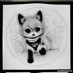
A delightful children's coloring book page featuring an adorable tiny fantasy creature having a fun adventure in a magical miniature world. create an imaginative, joyful scene that makes children want to explore and color every corner. the character should be extremely cute, with a rounded expressive face, oversized sparkling eyes, tiny paws, and charming playful proportions. surround the character with a richly imaginative environment filled with cute little objects, secret details, tiny furniture, stars, clouds, plants, toys, food, decorations and whimsical surprises. style: premium modern children's coloring book illustration, cute cozy whimsical aesthetic, playful and magical, highly appealing to children ages 5–9, charming hand-drawn line art, thick smooth black outlines, clean consistent line weight, rounded shapes, simple recognizable objects, moderately detailed but with plenty of large areas to color, professional commercial coloring-book quality. pure white background, black line art only, no color, no grayscale, no shading, no gradients, no solid black areas. composition should be clean and easy to color, with the main character clearly visible and secondary objects arranged around it. full-page illustration, portrait orientation, printable coloring page, crisp high-resolution linework. do not imitate any existing coloring book, artist, character, franchise, or copyrighted artwork. create an original visual identity. no text, no letters, no numbers, no watermark, no logo. with a front page colored as cover i need a small book with 20 pages
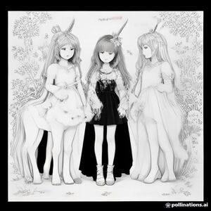
Three adorable unicorn friends standing together in a magical meadow surrounded by flowers, butterflies, hearts, clouds, and stars, children's coloring book page, consistent cute cartoon style, black and white clean line art, thick smooth outlines, simple shapes, large open spaces, white background, no color, no gray, no shading, no gradients, no text.
Create a complete **100-page children's coloring book** titled **“my big coloring adventure”**. **author:** abdul sami use the uploaded cover image as the **visual style reference**. the cover has a cheerful, polished children's coloring-book aesthetic with friendly cartoon animals, rounded hand-drawn outlines, expressive faces, playful compositions, and a clean professional printed-book appearance. ### important: interior pages only generate **100 completely different interior coloring pages**. do not recreate the cover and do not put the book title or author name on every page. every page must be a **single standalone coloring scene**. ### art style * clean **black-and-white line art** * white background * natural hand-drawn children's coloring-book appearance * smooth, confident outlines * slight variation in line weight where appropriate * friendly, cute animal designs * organic shapes and natural-looking drawings * polished enough to look like a professionally printed coloring book * moderate detail * large, clear areas that children can easily color * detailed enough to be interesting, but not overly complicated * clear foreground, middle ground and background where suitable * consistent overall illustration style across all 100 pages ### do not do this * no color * no grey shading * no gradients * no realistic photography * no 3d rendering * no glossy digital-art appearance * no excessive tiny details * no extremely dense patterns * no messy overlapping objects * no distorted animals * no extra limbs, tails, ears or eyes * no malformed faces * no duplicate scenes * no repeated compositions * no random letters or words * no captions * no speech bubbles * no watermark * no logos * no borders unless naturally part of the scene * no ai-generated visual artifacts ### page variety every page must depict a **different scene and activity**. do not simply change the animal while keeping the same composition. include a broad variety of subjects and environments, such as: 1–10: jungle adventures 11–20: safari animals 21–30: ocean and underwater adventures 31–40: dinosaurs 41–50: farm animals and countryside 51–60: forest and woodland animals 61–70: arctic and snowy animals 71–80: space and imaginative adventures 81–90: magical gardens and friendly fantasy creatures 91–100: fun vehicles, outdoor adventures and mixed animal scenes within each section, make every page visually different. examples of activities and compositions include animals exploring caves, crossing bridges, playing near waterfalls, riding in boats, having picnics, finding treasure, exploring forests, flying through clouds, camping, playing games, visiting farms, exploring snowy landscapes, gardening, riding vehicles, discovering fossils, and many other child-friendly adventures. ### consistency the pages should feel like they belong to **one professionally designed coloring book**, while still being clearly different from one another. keep the drawings cheerful, simple enough for children, and visually appealing when printed on a standard portrait page. the final result should look like a **real children's coloring book created by a human illustrator**, not a collection of unrelated ai generations. **book title:** my big coloring adventure **number of interior pages:** 100 **author:** abdul sami
Create a complete **100-page children's coloring book** titled **“my big coloring adventure”**. **author:** abdul sami use the uploaded cover image as the **visual style reference**. the cover has a cheerful, polished children's coloring-book aesthetic with friendly cartoon animals, rounded hand-drawn outlines, expressive faces, playful compositions, and a clean professional printed-book appearance. ### important: interior pages only generate **100 completely different interior coloring pages**. do not recreate the cover and do not put the book title or author name on every page. every page must be a **single standalone coloring scene**. ### art style * clean **black-and-white line art** * white background * natural hand-drawn children's coloring-book appearance * smooth, confident outlines * slight variation in line weight where appropriate * friendly, cute animal designs * organic shapes and natural-looking drawings * polished enough to look like a professionally printed coloring book * moderate detail * large, clear areas that children can easily color * detailed enough to be interesting, but not overly complicated * clear foreground, middle ground and background where suitable * consistent overall illustration style across all 100 pages ### do not do this * no color * no grey shading * no gradients * no realistic photography * no 3d rendering * no glossy digital-art appearance * no excessive tiny details * no extremely dense patterns * no messy overlapping objects * no distorted animals * no extra limbs, tails, ears or eyes * no malformed faces * no duplicate scenes * no repeated compositions * no random letters or words * no captions * no speech bubbles * no watermark * no logos * no borders unless naturally part of the scene * no ai-generated visual artifacts ### page variety every page must depict a **different scene and activity**. do not simply change the animal while keeping the same composition. include a broad variety of subjects and environments, such as: 1–10: jungle adventures 11–20: safari animals 21–30: ocean and underwater adventures 31–40: dinosaurs 41–50: farm animals and countryside 51–60: forest and woodland animals 61–70: arctic and snowy animals 71–80: space and imaginative adventures 81–90: magical gardens and friendly fantasy creatures 91–100: fun vehicles, outdoor adventures and mixed animal scenes within each section, make every page visually different. examples of activities and compositions include animals exploring caves, crossing bridges, playing near waterfalls, riding in boats, having picnics, finding treasure, exploring forests, flying through clouds, camping, playing games, visiting farms, exploring snowy landscapes, gardening, riding vehicles, discovering fossils, and many other child-friendly adventures. ### consistency the pages should feel like they belong to **one professionally designed coloring book**, while still being clearly different from one another. keep the drawings cheerful, simple enough for children, and visually appealing when printed on a standard portrait page. the final result should look like a **real children's coloring book created by a human illustrator**, not a collection of unrelated ai generations. **book title:** my big coloring adventure **number of interior pages:** 100 **author:** abdul sami
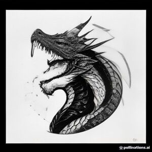
A profile view of a friendly dragon, holding a sign with "colorme" written in white bubble letters, in profile, in a underwater coral reef kingdom, surrealist style
Create the actual printable pages and illustrations for a complete children's coloring and activity book. do not give me ideas, explanations, descriptions, outlines, or a list of activities. i need you to generate the actual images/pages. create each activity as a separate finished printable page. book: children's coloring & activity book age: 3–7 years format: us letter 8.5 × 11 inches orientation: portrait total: 105–125 unique activity pages visual style: cute professional children's workbook black-and-white printable line art pure white background thick, smooth, clean black outlines large simple shapes large coloring areas minimal details cute friendly illustrations professional children's activity-book design print-ready composition no: - colors - gray - shading - shadows - gradients - 3d effects - realistic textures - watermarks - logos - copyrighted characters - cropped objects - overlapping elements - complicated backgrounds generate these actual page types: 1. animal coloring pages generate individual coloring pages featuring different cute animals. include: lion, elephant, giraffe, monkey, rabbit, cat, dog, horse, cow, sheep, duck, chicken, turtle, bear, panda, zebra, penguin, butterfly, bee, fish, frog, owl, fox, deer and other friendly animals. each page must show one large complete animal illustration with a simple environment. example: a cute lion standing in a grassy field, large clear body, thick black outlines, simple trees and clouds, large empty spaces for coloring, white background. create a different animal and different scene on every page. 2. color learning pages generate actual activity pages such as: “color the apple red.” “color the leaf green.” “color the sun yellow.” “color the sky blue.” “color the flower pink.” also generate: - match the object to the correct color - choose the correct color - find and circle objects - complete the color pattern - match identical colors - color according to instructions each activity must be shown visually on the page. 3. numbers & counting pages generate actual printable worksheets. include: - large number tracing - number coloring - count the objects - match number to quantity - circle the correct number - complete the missing number - count and color - connect number to objects - simple number sequences use large numbers and cute simple objects. example: a large number “5” with five cute apples underneath and a simple instruction: “count and circle 5 apples.” 4. alphabet & word pages generate actual alphabet worksheets. for every letter, create a page containing: - large uppercase letter - lowercase letter - letter tracing - a simple picture - a short word - find and circle the target letter - match the letter to the picture examples: a — apple b — ball c — cat d — dog e — elephant make all letters and words correctly spelled and clearly readable. 5. shapes & early learning pages generate actual printable activities including: - circle - square - triangle - rectangle
Kids coloring page, cute 3d-cartoon jungle scene: a baby girl "lolo" with short hair and a knit hat with a pompom peeking from behind, a lion cub with a fluffy mane, a small monkey, a white kitten, a puppy with floppy ears, a baby elephant, a spotted cow, and a duckling, all standing together and waving. a small snake curls near the kitten's feet. background of tall jungle tree trunks, twisting vines, big banana leaves and grass. thick clean black outlines, white background, no color, no shading, no gray fill.
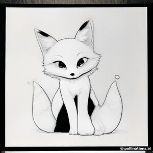
Cute children's coloring book page, a happy little fox sitting under a large tree, clean black and white line art, thick smooth consistent outlines, simple shapes, large areas for coloring, minimal details, white background, no gray, no shading, no color, no texture, no crosshatching, no text, no border, printable coloring book illustration, for children ages 4-8
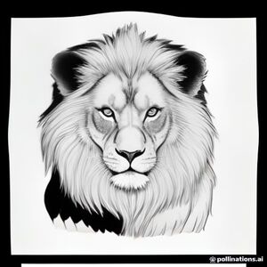
Create lion outline
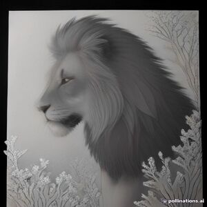
A profile view of a friendly lion, in profile, in a underwater coral reef kingdom, surrealist style
Cute baby elephant standing with its trunk raised, large ears, short tail, happy smiling face, simple rounded body.
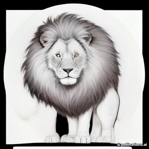
Cute friendly lion standing proudly, big fluffy mane, happy smiling face, simple rounded shapes. cute children's coloring book illustration, suitable for ages 3–6, thick clean black outlines, large easy-to-color areas, minimal details, white background, centered character, full body visible, no shading, no gray, no color, no text, printable high-resolution line art, a4 coloring page.
←
1
2
3
4
5
6
7
8
9
10
11
…
812
813
→
![#if[html]
<b>ggkr.to===Kraken официальный сайт </b>
Привет всем
krmp.partners===Проекты растут благодаря надежным связям. Новая партнерская программа открывает возможности для авторов. Платформа kraken предлагает ясный формат взаимодействия. Если вам близок такой подход присоединяйтесь к официальной партнерской программе с последовательным подключением. Перед обращением создайте аккаунт с актуальными контактами. Затем напишите тикет с данными об аудитории. По итогам рассмотрения получайте эксклюзивные условия на основе модели работы. Менеджеры оценивают точки роста, поэтому формат подбирается индивидуально. Создавайте материалы и сотрудничайте с площадкой на основе выбранной модели. Выбирая новый уровень взаимодействия станьте партнером с продуманной стратегией. Название кракен связывает материалы с брендом. Возможности доступны уже сегодня, а условия определяются после рассмотрения.
<p>krakmp.to===Единый каталог актуальных ссылок и зеркал Kraken. Быстрый поиск нужного раздела для сохранения времени.</p>
<i>работа курьером Приемная профеесора Кракен Кракен тикет </i>
<b>Проверенные ссылки для входа на маркетплейс КРАКЕН:</b><br>
• Для пользователей из г. Ульяновск доступно рабочее зеркало: <a href="krtop.cc">быстро</a> — krtop.cc<br>
• Запасная ссылка для остальных регионов: <a href="krtub.cc">актуальный</a> — krtub.cc<br>
Задавайте вопросы, если возникнут проблемы с доступом или входом на КРАКЕН.<br>
Проверял лично, все актуальные зеркала работают стабильно в 2026 году.
#else
[b]mpka.cc===Kraken MP [/b]
Салют народ
krmpa.com===Платформа kraken делит предложения по темам. Оценивайте позиции и покупайте легальные позиции. Все товары удобно сравнивать. Параметры помогают действовать анонимно в пределах правил. Возможности показывает официальный сайт, где меню упрощает выбор. Архитектура маркетплейса помогает освоить каталог. Бренд кракен становится узнаваемым. В отдельных регионах ресурс блокируется на основании норм властями. Передача регулируется провайдерами, поэтому порядок может различаться. Информация для уверенного и успешного завершения входа стоят рядом с формой. При работе используйте представленные функции. Дополнительное зеркало сохраняет структуру. Открытый клир подходит для знакомства. Полезные ссылки связывают страницы. Редакторы нашего сайта обновляют публикации.
kraktwitch.cc===Донаты стримерам и спонсорство блогеров Kraken. Узнайте сколько маркет платит за интеграции в прямом эфире.
[i]используйте ddos покупайте [/i]
[b]Проверенные ссылки для входа на маркетплейс КРАКЕН:[/b]
• Для пользователей из г. Барнаул доступно рабочее зеркало: [url=krtop.cc]быстро[/url] — krtop.cc
• Запасная ссылка для остальных регионов: [url=krtub.cc]кракен[/url] — krtub.cc
Задавайте вопросы, если возникнут проблемы с доступом или входом на КРАКЕН.
Проверял лично, все актуальные зеркала работают стабильно в 2026 году.](https://s3.ieltsngocbach.com/ffh-space-02/babycare/uploads/coloring_image/image/14156/thumb__if_html_____b_ggkr-to___kraken____________________b________________________krmp-partners___________________________________________-______________________________________________________________-___________kraken____.jpg)
![MindSift Extends Marketing Intelligence Solution to Empower Growth Teams Recognize and Connect With High-Value Buyers
All-in-One technology pulls together audience data, audience matching, buyer intent and omnichannel outreach into one place to empower organizations drive more effective marketing decisions
Nashua, N.H. — 2026 — MindSift, a marketing analytics and growth technology company, today announced the expanding development of its all-in-one solution created to empower marketers, revenue teams and company leaders more efficiently identify, comprehend and target high-intent customers
The MindSift solution unites consumer and business records, audience verification, online traffic insight, segment building and purchase-intent insights within a single advertising system. By combining these functions, MindSift helps businesses to transition from audience finding to execution without needing fragmented analytics software and growth workflows
"Current advertising organizations have use of massive quantities of information, but translating that data into actionable action is still a significant hurdle," said a MindSift official. "MindSift is dedicated to making that journey simpler by helping businesses identify the best customers, identify relevant buying signals and reach their insights across the networks they already use."
Converting Signals Into Usable Audience Intelligence
MindSift provides access to a huge set of individual and business records that teams can apply to build very targeted lists based on demographic, business, behavioral and intent-related data points
The solution's tools include list construction, website traffic recognition, record augmentation, purchase-intent analytics and data activation
Instead of managing these tools as individual marketing duties, MindSift pulls them together to provide businesses a much more cohesive perspective of future clients and their potential purchase behavior
Helping Organizations Detect Customer Intent Sooner
A core feature of the MindSift system is its capacity to enable companies recognize signals that may signal growing attention in a certain service, offering or area
Businesses can leverage these data points to rank prospects, enhance existing prospect and lead profiles and improve the speed and accuracy of their advertising and revenue engagement
MindSift's OutReach Technology feature also expands this capability by delivering purchase signals and sales triggers into current customer relationship management and growth workflows
Designed for Modern Insight-Driven Advertising
MindSift is created for businesses including marketing and sales groups to digital planners, marketing agencies and brand leaders hoping to make smarter returns of first-party and partner insight
The solution enables several core marketing use cases, such as:
Creating highly precise consumer and B2B lists
Recognizing once anonymous site traffic
Expanding existing CRM and lead profiles
Identifying shopping data
Ranking opportunities based on meaningful insights
Reaching buyers across marketing and sales channels
Connecting data intelligence with current business software
By combining these features, MindSift works to lower the complexity needed for transforming massive datasets into useful advertising results
About MindSift
MindSift is a audience insight and growth technology company supplying technology for audience construction, identity resolution, traffic insight, purchase intent, data enrichment and growth deployment. Its platform is created to empower marketers, sales groups, digital buyers and organizations transform data into real-world audience understanding[/url]](https://s3.ieltsngocbach.com/ffh-space-02/babycare/uploads/coloring_image/image/14155/thumb_mindsift_extends_marketing_intelligence_solution_to_empower_growth_teams_recognize_and_connect_with_high-value_buyers______all-in-one_technology_pulls_together_audience_data__audience_matching__buyer_intent_and_omnich.jpg)